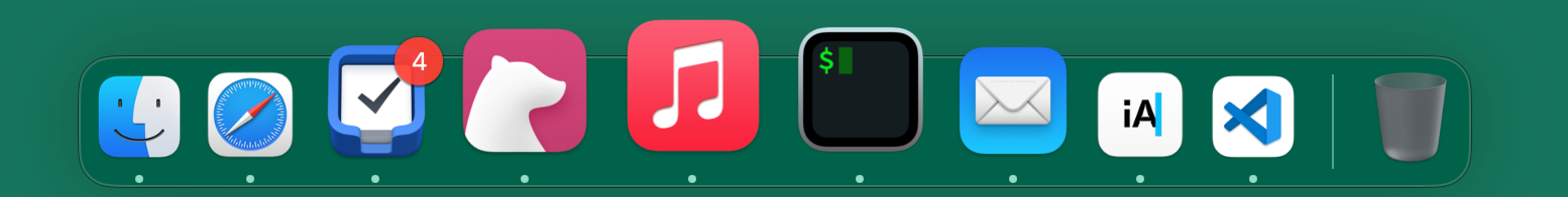
I like the hover effect on the MacOS dock. The so-called magnifier effect. When you hover on a particular app, it gets magnified. The apps next to it on the left and right get magnified as well. But less. This effect can stretch a few apps to the left and right. The further from the hovered app, the less it gets magnified.
Let's try to recreate this effect in only CSS!
This article has some live examples embedded created with plain HTML. As such, they will not work in RSS readers. The examples rely on :hover, meaning they do not properly work on devices with touch interfaces.
The adjacent-sibling combinator #
The first step is setting a hover effect on .item. We can choose a lot of different effects, but let’s keep it simple. We are going to stretch the item.
.item:hover {
  transform: scaleY(1.5);
}
A part of the solution is using the adjacent-sibling combinator, the +. I got familiar with this combinator years ago, through Heydon's Pickering owl selector. It gives us control over the element matching the selector on the right of the +. It applies an effect if the previous element corresponds with the right-hand side of the +.
When we use .item:hover + .item we can target the item on the right of the hovered element. We can even target the second element on the right, by doubling the usage of +.
.item:hover + .item {
  transform: scaleY(1.35);
}

.item:hover + .item + .item {
  transform: scaleY(1.2);
}
With this, we are halfway to getting the effect we want! Just look at the live example below.
See you on the other side, or not... #
But now we need to create the same effect on the left. The name “adjacent-sibling” would suggest siblings on both sides, CSS does not work that way. HTML and CSS pas parsed line-by-line. That means that CSS does not know about elements further down the DOM tree. And that is what we need. We want to know if the next element has a hover event on it.
The subsequent-sibling combinator(~), or general-sibling combinator, does not help either. This combinator again can only look at elements already parsed. So .item:hover ~ .item does not create an effect on all elements with class .item on the same level as the hovered element. But instead, it creates an effect on all elements with class .item after the element with .item:hover. Just take a look at the live example below.
Entering the “previous-sibling combinator” #
CSS does not have a combinator that can do what we want. But since the beginning of this year, all major browsers support something that does make it possible. The :has() selector. This selector opens a lot of new doors. And I mean a lot. This particular new selector allows us to take further down the DOM tree. Effectively looking forward to the parsing of HTML and CSS.
:has() is often called the “parent-selector”. It allows you to apply styles on a parent, based on conditions in the child elements. In the above snippet of CSS, an element with class .parent will get a red background, if one of the direct child elements has the class .child-condition.
.parent:has(> .child-condition) {
  background-color: red;
}
We can create the opposite of the adjacent-sibling combinator. A “previous-sibling combinator”. In the snippet below we apply a red background on .a if the next element is on the same level as class .b.
.a:has(+ .b) {
  background-color: red;
}
Now if we replace this with .item:has(+ .item:hover) we can get the effect we want. This selector tells the browser to apply a style on an element with class .item if the next element has class .item and the hover event. We can stretch over multiple siblings. The code snippet below shows you how with a live example below it.
.item:hover:has(+ .item) {
  transform: scaleY(1.35);
}

.item:hover:has(+ .item + .item) {
  transform: scaleY(1.2);
}
Wrapping up #
By using :has() we can create the opposite of the `adjacent-sibling combinator”. This opens new doors in creating stunning and powerful new visual effects, with pure CSS. Like the magnifier effect of the MacOS dock. The full code can be seen below, and a live example can be found on codepen.
.item:hover {
  transform: scaleY(1.5);
}

.item:hover + .item,
.item:has(+ .item:hover) {
  transform: scaleY(1.35);
}

.item:hover + .item + .item,
.item:has(+ .item + .item:hover) {
  transform: scaleY(1.2);
}