Combining :placeholder-shown and :has
Yesterday my wife (also a front-end developer) came to ask for my help with something. She read something about a :placeholder-shown selector and was wondering if it could solve her problem. Upon receiving the question I (almost) had visual question marks floating above my head. I never heard of this selector before. Is it new? Is it even supported? What does it do? To my surprise, I found that the first browser released support in 2015 already. Because we can use it, I started wondering what I could do with it.
Material UI input fields #
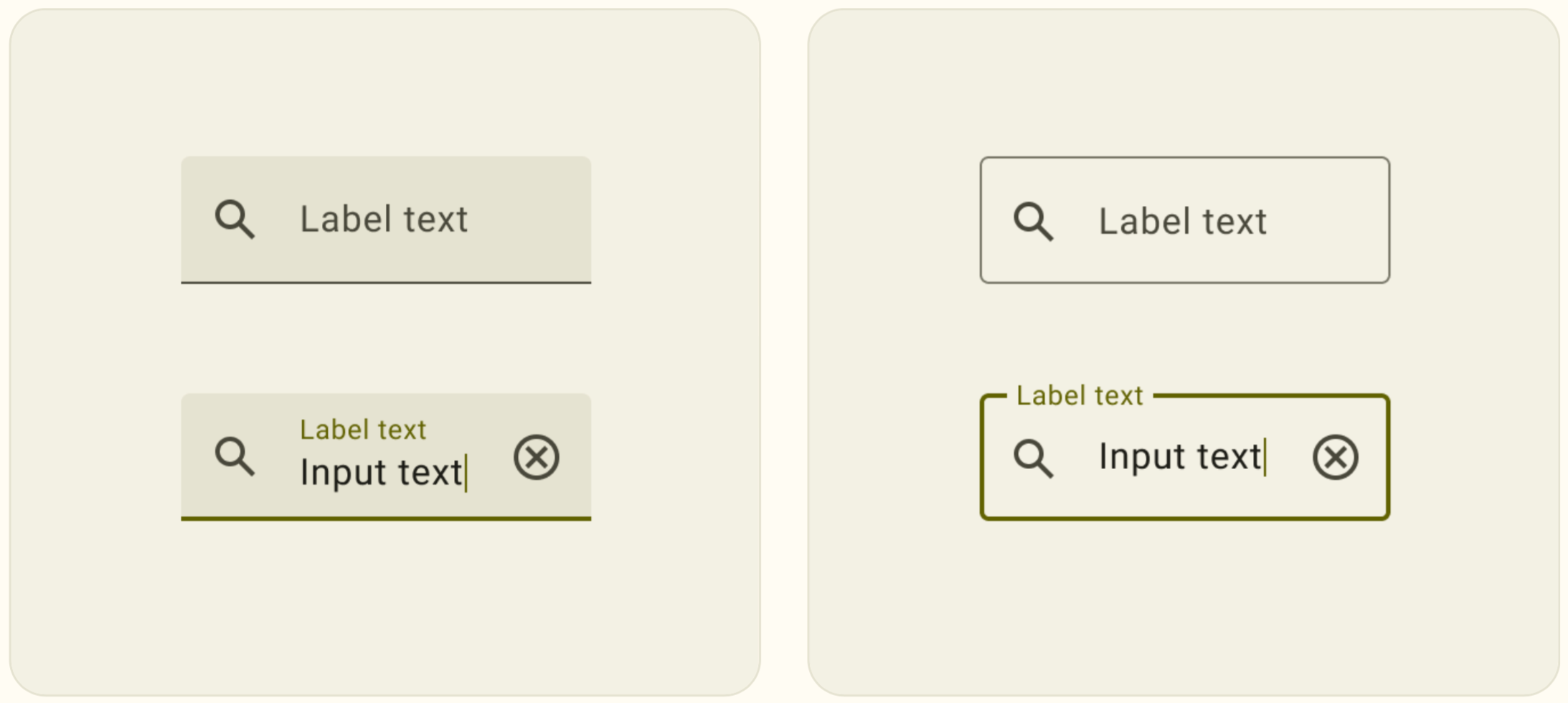
A lot of us are familiar with Material UI, the design language of Android apps. But, Google also uses it for its web apps. Years ago already, they had these fancy input fields. These were input fields without a visual label. But once you wanted to start typing, the placeholder moved from its position. It would become an actual label.

The actual libraries that implement this type of input field use a lot of JavaScript to get it done. Just inspect a web app with it, and you see a lot of CSS classes added to the parent element once an element gets the focus.
But I still like these types of interactions. So I was wondering if the :placeholder-shown could be a CSS-only solution for this.
A CSS-only approach, kinda #
The :placeholder-shown does exactly what it suggests. When using it on input:placeholder-shown, you can apply CSS properties only when the placeholder is visible. When wrapped in :not() you get the opposite effect. You can apply properties when the placeholder is not visible. When the input field has a value.
My first test to see if the described effect was possible to develop was really simple. I combined several selectors to see if I could make something appear on the screen.
/* does not work ... */
input:not(:placeholder-shown)::after {
  content: "hi!";
  display: block;
}
Unfortunately, this does not work. You see, ::before and ::after only work on containers, elements that can have child elements. <input /> by definition cannot have a child element. So ::before and ::after cannot be applied to input (or similar) fields. So we have to wrap the field. That is not such a big deal. In many component-based architectures this already happens (e.g. adding a label or optional error message).
The Material UI example uses this type of visual interaction for the label belonging to the input field. My original approach (that did not work) of using ::after is not actually that accessible. It is a lot better to use a normal <label> element anyways.
<div class="parent">
  <label>Some input</label>
  <input placeholder="Some placeholder (required)" />
  <div></div>
</div>
With this HTML structure we can use the new :has to create the desired result. As label is positioned first in the DOM, we need to work width the position and z-index attributes.
.parent label {
  display: none;
  position: absolute;
  top: 0;
  left: 0;
  z-index: 1;
}

.parent input {
  position: absolute;
  top: 0;
  left: 0;
}

.parent:has(input:not(:placeholder-shown)) label {
  display: block;
}
That is one complex CSS selector, but it works! It says: "If you have an input field where the placeholder is not visible, show the <label>".
The :has selector is not yet turned on by default on Firefox as of the writing of this article. Chrome-based and Safari-based browsers have :has support since halfway through 2022.
Of course you can add some additional styling to better place the elements. But, we now have an accessible input field with a proper label and placeholder. It gives us the visual effects of the Material UI library, but remains accessible. Best of all, it does not require JavaScript for the desired effect.
Wrapping up #
First of all, know that showing the label at all times is always the better and more accessible solution. But if you find yourself looking for this visual effect, this might the approach for you. It shows again the power of modern CSS and the new possibilities. You can see the live effect on this codepen. We now only have to wait for Firefox to support :has...