Dark mode using progressive enhancement
Some time ago I came across a very interesting question on Twitter. Is it possible to implement dark mode with progressive enhancement, i.e. without JavaScript? The one asking the question suggested :has, but that selector is not very well supported yet. But in the replies I found an answer focused on existing browser APIs for HTML and CSS. I was dying to try it out for myself, to see if we can make it work.
Progressive enhancement is a design philosophy that provides a baseline of essential content and functionality to as many users as possible while delivering the best possible experience only to users who can run all the required code. In practice, this means relying as much as possible on HTML and CSS, and less on JavaScript.
Initial implementation #
The suggested implementation starts with a well-positioned <input /> element, as shown below. It is a simple (hidden) checkbox input field as the first element in the <body> of the HTML document.
<html>
  <body>
    <input id="theme-toggle" type="checkbox" hidden />
    ...
  </body>
</html>
When the <input /> element is the first child of the <body>, we can target all ‘general sibling’ elements, using the ~ selector. This selector allows us to target all elements that live on the same level as our <input /> element, and set values on them. Below you can see this selector applied twice. First target our #theme-toggle. Next, we set custom properties that cascade down for the two states of the input fields. Using the :not(:checked) allows us to target all siblings when the input field is not checked, while :checked does the opposite. This allows us to define variables for our basic themes.
/* light theme */
#theme-toggle:not(:checked) ~ * {
  --background: var(--white);
  --foreground: var(--black);
}

/* dark theme */
#theme-toggle:checked ~ * {
  --background: var(--black);
  --foreground: var(--white);
}
With the basic implementation setup, we still need the ability to add user interaction. As we are looking at a progressive enhancement implementation, we try to avoid a JavaScript implementation. Luckily for us, HTML has all we need. Anywhere in the HTML, we can use a <label /> element with the for=“...” attribute. Everything within the <label /> element is now clickable and will switch the state of the <input /> with the corresponding #id. This implementation is mostly used in forms to make, drum rolls, labels clickable. But, this works across the entire HTML document.
<label for="theme-toggle">...</label>Complying with system preferences #
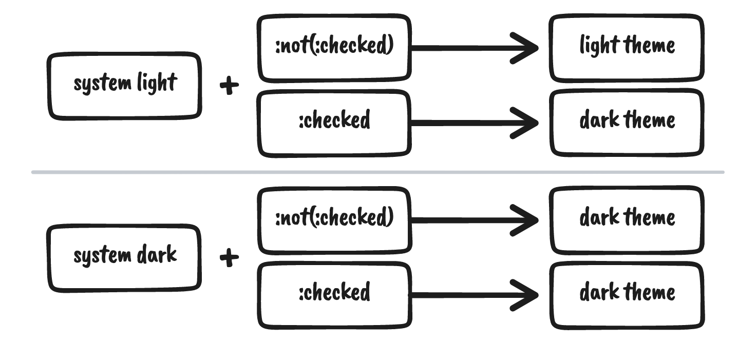
One of the downsides of this implementation is the lack of compliance with user preferences/system defaults. It hardcoded sets the default theme, in the example to a light theme. But what if a user prefers dark mode? This adds some complexity, because the meaning of the <input /> differs based on the starting point of your application. When you start in dark mode, the :checked should now correspond to a light mode. It becomes easy to switch to a JavaScript implementation at this point, but CSS has you covered. But let’s look at the different states we have first.

With CSS we can target the system (or browser) preferences using a media-query. Specifically, we can target the prefers-color-scheme. Here, we can look for both the ‘light’ and ‘dark’ values. When we want to comply with all four use cases, we need to apply the previously defined theme selectors in both values of prefers-color-scheme. We need two media-queries.
/* for system light mode */
@media (prefers-color-scheme: light) {
  #theme-toggle:not(:checked) ~ * {
    ...;
  }
  #theme-toggle:checked ~ * {
    ...;
  }
}

/* for system dark mode */
@media (prefers-color-scheme: dark) {
  #theme-toggle:not(:checked) ~ * {
    ...;
  }
  #theme-toggle:checked ~ * {
    ...;
  }
}
Styling the theme toggle #
Let’s create a toggle with the labels of the two themes in them. Visually the selected state of this toggle should correspond to the theme, like the screenshot below.

This is an easy implementation with surprisingly little work compared to the implementation up until now. Luckily for us, the <label /> element can be styled similarly to any <div />. So we only need the HTML snippet below.
<label for="toggle">
  <div id="dark">Dark</div>
  <div id="light">Light</div>
</label>
The main styling of the toggle is shown below. As you can see, no real callback to the implementation we have had up until now. We use only one of the theme variables (--foreground), and references to the generic color variables. Everything else for this simple toggle just works out of the box due to the selected colors. Of course, more complicated toggles can be implemented as well. These would require more complex CSS.
label[for="theme-toggle"] {
  cursor: pointer;
  display: flex;
  flex-direction: row;
  border: 1px solid var(--foreground);
  width: max-content;
}

label[for="theme-toggle"] div#light {
  background: var(--black);
  color: var(--white);
}

label[for="toggle"] div#dark {
  background: var(--white);
  color: var(--black);
}
Implications and wrapping up #
Like many complicated progressive enhancement implementations, this one comes with some clear downsides. There are three major downsides to this implementation. If the user manually chooses a theme, that theme will not persist without the help of JavaScript. With every refresh or page change (excluding single-page applications), the color mode will go back to default. The second issue is that the <html /> and <body /> elements cannot be targeted with the theme, as the themes are defined on a lower level, with additional boilerplate code compared to the most straightforward implementations available.
However, the implementation itself is very powerful. It shows that HTML and CSS can accomplish a lot more than most people think. With creative and more complicated usage of what the browser provides you can create sophisticated solutions without the help of JavaScript. However, I would suggest to only use the media-queries, or implement a full theme solution.